

Slandering the Foreigner
On Using Data Responsibly to Tell the Right Story

I’m due installment five of my series on Reformed Christian Nationalism, and I’ll have that post out in the near future. But I saw something floating around the internet this week that bothered me (I know, I know). It bothered me because it involved two things that matter to me: people and data.
On January 4, 2026, the President of the United States “truthed” out a table without comment or citation. The table was simple enough: one column listed “Country of birth,” the other “Percent of immigrant households receiving assistance.”
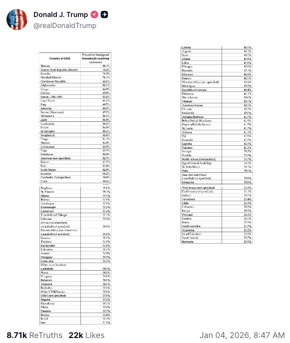
The post made the rounds, of course, as incontrovertible evidence for the ostensible drain on government resources by foreign-born peoples. Immigrants are increasingly blamed on everything from traffic, to housing shortages, to now, welfare burden. And here is a damning smoking gun!
But is it? The interpretation that many seemed to take from this table is that certain groups of foreign-born individuals create a significant drain on public aid resources. Is that what’s happening here?
I am going to tackle this in two parts: first, a deep dive into the numbers about place of birth and welfare usage; second, a word on why telling the right story with those numbers matters.
Telling the True Story
The images posted by the President of the United States have no citation, no source, no attribution whatsoever. That, of course, makes checking the math rather difficult. So let’s dip into the American Community Survey conducted by the United States Census Bureau. For our purposes, we’ll be using the Public Use Microdata Sample (PUMS), because it allows us to measure things the summary files don’t include. I accessed the 2024, ACS 1-Year dataset, grabbing information on place of birth, receipt of food stamps (SNAP), receipt of public assistance, and whether individuals accessed Medicaid.
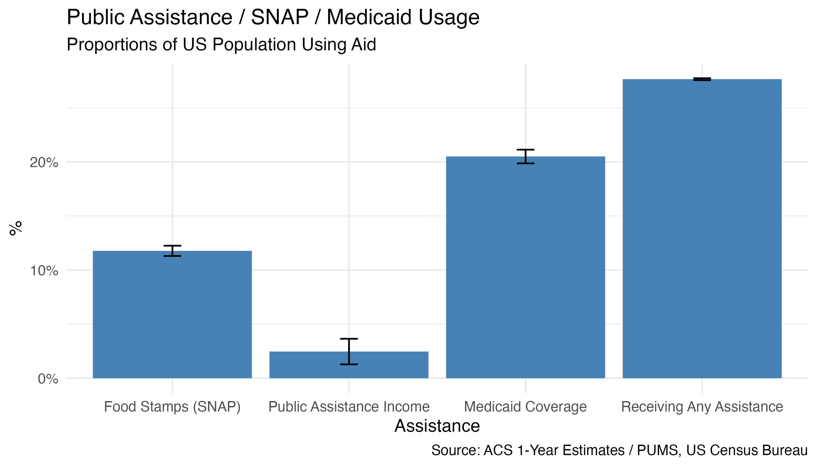
Just so we have some benchmarks, let’s look at the overall US participation of SNAP, public assistance income, and Medicaid. Using 2023 ACS 5-Year estimates, we can see that 11.8% of households in the United States reported SNAP benefits in 2023, 2.7% of households in the United States reported public assistance income, and 20.7% of individuals reported Medicaid coverage. NB: this is not limited to American citizens; the ACS surveys include citizen and non-citizen respondents.
We should note that other forms of social support may be considered here, but these are the two measures available on the ACS.
But the presenting issue isn’t the extent of government assistance to Americans as a whole, but rather rates of assistance by place of birth.
Our first table looks at the proportions of households receiving any kind of welfare in the previous twelve months, by place of birth. To create this data, I made a binary flag set to 1 if the respondent received SNAP benefits or Medicaid or other public assistance. If there is more than zero receipt of welfare, per household, then they are included in this chart.
Now, this gets a little hairy, so let’s be clear on what we’re actually seeing. The ACS lists place of birth and Medicaid status on a per-person basis, but SNAP benefits and public assistance income is recorded on a household-level basis. So what we’re actually seeing is place of birth for primary householder for a household that receives any aid. Additionally, place of birth is not just the country of birth; it includes the US state of birth for US native citizens. Finally, some entries have standard errors that are too large, and we should use caution in interpreting the estimates. I have marked these with “nr” (“not reliable”).
Now, I suspect that the numbers the President is posting reflect something similar to what I’ve generated here: any receipt of welfare benefits, including Medicaid, food stamps, or public assistance income. But because we’re already here, and you’re still reading, let’s get a little more granular.
Next, the proportion of households who use SNAP benefits by place of birth.
The following table describes proportions of households receiving public assistance income by place of birth. Because the overall numbers are smaller, the standard errors are larger, meaning the data is less reliable in this table.
Finally, let’s look at Medicaid numbers. The ACS PUMS data registers Medicaid receipt by individual, not household. So to be consistent, I created an “any Medicaid” flag. This table counts a household if anyone in that household receives Medicaid benefits.
The frustrating thing about the data the President posted is that there is no context for the numbers supplied. Is this individual-level data? Household-level data? What is included in the “assistance” column? Everything? Only some things?
One thing is clear, no matter what angle I look at, I cannot get it to align in a meaningful way with publicly available, methodologically-sound data supplied by the US Census Bureau. To make this clear, I transcribed the table posted by the President, cleaned the data to align place of birth with the data available from the ACS, and built a side-by-side comparison with the above tables. The most interesting column is the difference column (you may have to scroll to the right), where you can see that the President’s numbers are both over- and under-representative of that available from the ACS.
Telling the Right Story
This is the logical question. So what? The first, and primary issue is that the President of these United States is poasting stats without any reference or source. At best, it’s frustrating; at worst, it’s dangerous, depending on the issue. My goal here is to test the validity of these numbers, since they are coming from the most powerful office in the land, and to call for a deeper commitment to truth.
The second issue stems from the first. Because, the hours I’ve spent on this post are, on the one hand, an exercise in futility. I mean, quibbling over statistics (especially unsourced ones) isn’t the most important thing any of us need to be doing right now. Furthermore, I doubt those using and posting these statistics hardly give a thought to the interpretation of those numbers. They’re just another weapon to use in the war of ideology.
But that’s precisely where we need to pause. Because all statistics tell a story about something. And these are no exception. When looking at data like this, we need to ask two questions: (1) do these numbers tell us true things about reality?, and (2) am I using these numbers to tell the right story?
Data is only meaningful in the hands of human beings who interpret it. One of the challenges of any social science is to make sure that we are interpreting the data not just accurately, but faithfully.
So what story does this data tell us? Or better, what is the right story this data tells us? It’s clear, from the census data above, that place of birth does seem to tell us something about rates of government assistance. But what do these numbers mean?
Do they tell a story of exploitation and abuse of public resources? Or do they tell a more complex story about geopolitical realities, reasons for emigration from difficult homelands, and the experience of xenophobia/misia or racism in the United States?
Social reality is complex. And telling the right story about social reality involves a complex telling. To flatten, over-simplify, or look for monocausal explanations invariably distort the data, and tell a story we want to tell, rather than the story that is.
The data posted by the President of the United States is currently being used by people who are telling a particular story—the story they want, not necessarily the story that is. And it’s a dangerously flat one.
Shortly after the President posted this table, a Tennessee congressman quote-tweeted it on X with the single word “Remigration,” which was subsequently retweeted by Stephen Miller, Deputy Chief of Staff for Policy in the White House.


The idea of “remigration” once sat tucked away in the dank corners of the far-right. It describes an effort to reverse migration patterns, returning foreigners to their place of birth (and hence, far away from “us”). This word, a recent favorite among the Reformed Christian Nationalists I study, has now entered mainstream political discourse. I mean, the official Twitter account for the Department of Homeland Security uses it.

And friends, that should trouble us. In a previous generation, we’d call this concept ethnic cleansing. But now we have sitting US representatives, senior advisors to the President, and official government agencies calling for “remigration,” and using data like this to bolster their case.
These folks are using the data to tell a very flat story of immigrants-as-invaders; of ethnic replacement; of fear and loathing of those who are different; of a perceived loss of a homeland, culture, or heritage. Data on place of birth and welfare is being selectively used to make the case that “we” are being overrun by “them.”
And I don’t think you need me to tell you what happens if this narrative goes unchallenged.
The right story is far more complex. The reasons for migrant poverty and social safety net usage are complex. The right story is not the flat one, whispering that people from X, Y, or Z country are drains on social services. The right story must incorporate the whole picture: that we are a country which has historically welcomed immigrants for many different reasons, inviting them to set down roots in the United States. The consequences of these invitations have always had complex effects—and we are seeing one snapshot of that reality here. But it is just that: one snapshot; one angle; one slice.
For the sake of truth, we need to hear, and tell the whole story.
—Till next time.
Thoughtful and thought provoking as always, but I'm mostly delighted by the xkcd reference.
Doing the deep dive into data sets is difficult. Forming the resulting findings into nuanced insights is time intensive. Effectively communicating the whole picture of those insights to other people - Herculean. Thank you for doing the hard and thankless work of truth telling in a world obsessed with easy propaganda.